• Skip to main content
  • Skip to footer

Havelock London

Modern Value Investing

  • About
  • News
  • Contact us
  • Fund
  • Investment Approach

Kate Land

July 23, 2019 By Kate Land

Value vs growth… why not have both?

As the name implies, when you own a share you own a slice of a business. The market price of your share should depend on the existing value in the business and the future value it is likely to create. In his Nobel prize winning work on the empirical analysis of asset prices, Professor Robert Shiller demonstrated that over the long-term, market prices do indeed track earnings.

Figure 1: The inflation adjusted price and cyclically-adjusted earnings of the S&P 500 (left), and their ratio (right).
Figure 1: The inflation-adjusted price and cyclically-adjusted earnings of the S&P 500 (left), and their ratio (right).

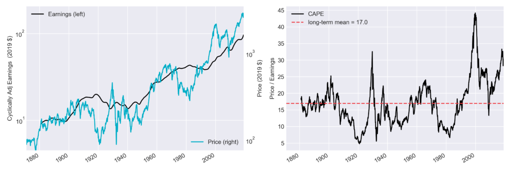
However, in the same work Shiller showed that prices fluctuate more than they should if market participants were always responding rationally to new information. This means there are periods when prices and fundamentals dislocate. How you spot such a dislocation is an important, valuable, and difficult question to answer. In Figure 1 we see that the price-to-earnings ratio of the S&P 500 is high with respect to history[1], having only peaked above 30 twice before in the 150 years of data we have. Whether this does or does not represent a dislocation partly comes down to whether these stocks are set to experience a very high level of growth in their future earnings, among other factors.

The performance of ‘value’ and ‘growth’ portfolios (left axis), and the rolling annualised out-performance of value w.r.t growth over 10 years (right axis).
Figure 2: The performance of ‘value’ and ‘growth’ portfolios (left axis), and the rolling annualised out-performance of value w.r.t growth over 10 years (right axis).

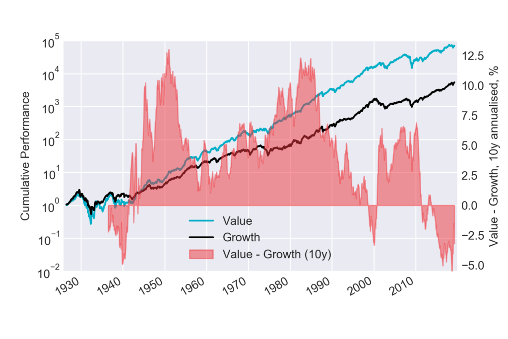
Much has been written about the relative performance of value and growth stocks during this long-in-the-tooth bull market. In Figure 2 we show the historic performance of a value and a growth portfolio since 1926[2]. In the last ten years (to Dec 2018), the value portfolio has returned 11.0% annualised, and the growth portfolio 15.1%. Such relative performance appears to be remarkable; across history value has rarely underperformed growth in any ten-year period.

But what exactly do the terms ‘value’ and ‘growth’ mean? A very specific methodology is used to define the portfolios shown in Figure 2[3], and many other methodologies exist using different fundamental metrics, metric combinations, datasets, selection criteria, and weightings. All applied to different universes of stocks.

Are the terms ‘value’ and ‘growth’ understood? And are they useful for making investment decisions?

Any metric based on recent realised fundamentals provides only a crude view of what you need to know to make good long-term investment decisions. You need to understand the future fundamentals of a company in order to know what price you should be paying for its shares. At Havelock London we do in-depth data-driven research into companies to understand their potential future earnings, and uncertainties. We are “valuation” investors rather than value investors. A stock doesn’t have to have a low price-to-earnings multiple for us to like it. But it does have to be trading at an attractive price, relative to realistic expectations of its earnings.

By using data to identify companies that we believe are good quality and are trading at attractive prices we are not simply ‘value’ or ‘growth’; we are both.


Footnotes

[1] Data courtesy of Prof Robert Shiller (http://www.econ.yale.edu/~shiller)

[2] Data courtesy of Prof Kenneth French (https://mba.tuck.dartmouth.edu/pages/faculty/ken.french/)

[3] The methodology follows that of the Fama-French “HML” factor; US stocks are ranked by price-to-book each year with the top and bottom 30% assigned to ‘growth’ and ‘value’ portfolios respectively. Equal weight is given to small and large stocks within each portfolio, to separate a value effect from a size effect.

Filed Under: Commentary

March 12, 2019 By Kate Land

Concentrating on risk

Successful active management comes from two components; investment selection and portfolio construction. Very crudely, the former is about maximising long-term returns and the latter is about ensuring there are no surprises on the way. Effective diversification requires identifying feasible scenarios that could impact a portfolio and determining portfolio weights that make it as resilient as possible.

The minimum number of securities required to achieve adequate diversification is a recurring question among investors and academics. It depends on an investor’s risk tolerance, and the scenarios most relevant to the securities in the portfolio. But one scenario that all portfolios are exposed to is that of idiosyncratic shocks in individual securities. Concern for exposure to single-name events drives investors to prefer larger portfolios to smaller ones, however the relevant risk is not usually well quantified, and the distribution of weights is as important as the portfolio size.

To explore this, we develop a metric that quantifies the single-name risk of a portfolio by establishing its effective size. While several metrics exist that quantify portfolio concentration, they generally lack interpretability in terms of risk[1]. Our metric is based on the chance of experiencing losses from single-name shocks, thus it goes straight to the heart of the matter[2].

We review some well-known indices in the table below and find their effective sizes to be much smaller than the headline number of assets[3]. This is a result of weight being unevenly distributed and concentrated in a relatively small number of holdings. In these examples, the effective size is well approximated by 2 x the number of assets covering 50% of the portfolio, which drives home the fact that it is the size of the largest positions that determines the exposure to single-name risk and not the number of assets in the portfolio.

IndexNumber of assetsEffective sizeLargest weightSum (number) of weights > 5%Number covering 50%Gini coefficient
FTSE1001002511.3%24.7% (3)110.59
NASDAQ100229.7%36.9% (4)90.61
S&P500500993.6%0% (0)500.60

Rather than working with simulations, heuristics often form the basis of practical approaches to managing diversification. One well established rule is the 5/10/40 restriction placed on most UCITS funds which says that no single weight can be greater than 10%, and weights greater than 5% must total less than 40%. This equates to a minimum effective size of ~15-18[4]. It is interesting to note that these rules are relaxed specifically for UCITS schemes that replicate indices, and the FTSE100 and the NASDAQ are frequently at odds with them[5]. Therefore, products that track these indices can, and do, take positions that are prohibited for an active manager.

We conclude that it is important to look past the number of assets in a portfolio in order to assess risk. Equity funds that contain ~25 stocks will generally be referred to as ‘concentrated’ by the industry, but as we have seen here these portfolios may have lower risk levels than those with a much larger number of assets. Working with metrics that meaningfully quantify the risk you are concerned with is key to effective risk management.


[1] For example, the Gini coefficient compares portfolio weights to those of an equally-weighted portfolio of the same size. This does not help to understand the risk associated with portfolios of different sizes, as seen in the table.

[2] We simulate 106 10y futures in which each asset in a portfolio has a 1% chance of experiencing complete loss in a single year. We quantify exposure to large losses with a weighted-count of 10y losses >15%. Effective size is defined as the size of an equally weighted portfolio with the same exposure to large losses, using the same methodology. Using like-for-like analysis makes the effective size metric robust to the underlying assumptions of the simulations.

[3] Index weights are as of 31/12/18, 15/02/19, and 14/02/19 for FTSE100, NASDAQ and S&P500 respectively. Multiple share classes for the same issuing body are combined.

[4] The higher of these considers that it is not practical to maintain weights exactly at the boundaries of what is permissible.

[5] For example, the FTSE100 largest position is currently 11.3%. Further, as of 16/11/2018, the NASDAQ had 41.0% of its weight in just 4 positions with the largest at 11.9%.

Filed Under: Commentary

Footer

The value of investments may fall as well as rise. Investors may not get back the amount originally invested. Past performance is not a reliable indicator of future results.

Important information | Privacy policy
Best Execution policy | Complaints policy summary | Remuneration policy summary | Responsible Investment policy | Stewardship code
Havelock London Ltd is authorised and regulated by the Financial Conduct Authority (FCA reference number: 799920). The company is registered in England & Wales at 19 Eastbourne Terrace, London W2 6LG (registered number: 10874884).

Copyright © 2025 All Rights Reserved