As an active investor I spend a lot of time thinking about if we are living through an “AI Bubble”, and if so, what I should be doing about it. The goal of this essay is to organise my own thoughts on the subject, and we are publishing it in the hope that it may also prove useful to others.
What do you mean by bubble?
An economic bubble (also called a speculative bubble, asset bubble, or simply financial bubble) is a period when current asset prices greatly exceed their intrinsic valuation, being the valuation that the underlying long-term fundamentals justify.[1] – Wikipedia
If only it were that easy! Whilst this definition has the virtue of being succinct, it skims over the fact that estimating intrinsic value is incredibly hard. Financial bubbles are typically associated with new technologies, meaning that “long-term fundamentals” are at best uncertain and at worst unknowable. This is evidently the case with AI.
I think the concept of a bubble is better captured by Alan Greenspan’s “irrational exuberance” quote, which suggests that a bubble forms when the prices of certain financial assets become driven more by ebullience than what is reasonably knowable about the future. The focal point becomes asset prices themselves, with anticipating the actions of the crowd becoming more important than long-term fundamentals. Is this where we find ourselves with AI?
What do you mean by AI?
Artificial intelligence (AI) is the capability of computational systems to perform tasks typically associated with human intelligence, such as learning, reasoning, problem-solving, perception, and decision-making.[2] – Wikipedia
I think the Wikipedia definition here does a much better job. Although the AI acronym has become synonymous with generative models, the field of artificial intelligence is much broader than this and dates to the 1950s. The launch of ChatGPT in November 2022 made AI a mainstream concept but with a background in computing and statistics I have seen AI’s earlier incarnations.
The concept of AI is intermingled with the broader trend to use data, computers, and algorithms for automation. My favourite example of this is self-service tills in the UK, which have displaced supermarket checkout operators. It is an example of automation that created job losses, but it did not require a general-purpose AI or large language model to make it happen.
For the purposes of discussing an AI Bubble, my focus is on the general-purpose AI algorithms that require massive amounts of computing power, as this is where the big sums of money are being spent.
Rapid growth and the need for physical assets
The adoption rate of models like ChatGPT, as measured by the growth in user numbers, appears to have been more rapid than any prior new technology[3]. ChatGPT took just 2 months to reach 100 million users, and it is estimated that 30% of the US population were using it after just two and a half years. The chart below allows us to compare this to other significant new technologies in the last 100 years.

Source: https://statmodeling.stat.columbia.edu/2012/04/08/technology-speedup-graph/
The internet is the most recent technology included in this chart and has proven itself as general-purpose. In the years since 2005 (when the chart ends) we have seen the creation of many large software businesses built on top of the internet, meaning that they could grow rapidly with minimal requirements for physical assets. In particular, the marginal cost they incur for each new customer is low, making them highly profitable as they reach scale.
General purpose AI models sit between previous physical technologies, and internet-based software. Their rapid adoption is facilitated by the internet, but the marginal cost of serving extra users is high, as it requires increasing amounts of computing power.
The need for computing power requires the construction of data centres, with all the physical assets that they entail. Land, steel, electricity, water, and more besides. Vast amounts of capital are being raised to fund these assets, and it is the risk that this capital does not generate an adequate return that begs the question of if we are witnessing a bubble.
Why the need for so much computing power?
There are two distinct reasons why the current crop of AI algorithms needs computing power; training and inference. Training is the one-off stage required to create a new “foundational model” which has been costing $50M-$200M[4] a pop, due mainly to computing costs. These are relatively small sums of money in the context of technology companies, it being approximately a single day’s free cash flow for Google’s parent company Alphabet.
Training a foundational large language model can take several months[5], and so is a time-consuming job. The training is undertaken using specialist processors optimised for matrix computations (GPUs – graphics processor units), which is a technology dominated by Nvidia. They are motivated to keep releasing new generations of chips, each of which allows model to be trained more quickly than the last. It is the race to train the best model that has driven demand for cutting edge GPUs and helped turbo charge Nvidia’s profits. This is illustrated below by their impressive gross profit margins.
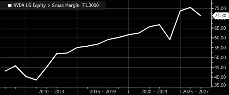
Source: Bloomberg
Inference is what happens every time a question is asked of the model. By comparison, inference requires much less computing power than initial training, but the amount of computing resources scales with the amount of activity. More specifically inference costs are based on the number of “tokens” processed, where a token is a unit of information[6] such as a part of a word or some pixels from an image.
It is the massive increase in inference that is driving demand for data centres, and it is why we are seeing an explosion of planned capital expenditure. Unlike training, inference is not dependent on using the most cutting-edge chips and can make use of older GPUs. Despite this the sheer volume of activity means that it is inference where the real money is being spent.
Memory Prices
Recent estimates[7] of the upfront costs to construct a 1GW AI data centre, suggest a total cost of $38 billion, of which 55% is spent on servers. Hence, much of the planned capex will flow directly to hardware manufacturers. Nvidia are beneficiaries of this, but where it is currently being felt is in the demand for memory chips, which are produced at scale by only three companies; Samsung, SK Hynix and Micron.
Memory chips are a material, but not dominant, component of server costs. However, they really matter for inference as they are the primary determinant of speed. Put simply, using the most modern and fastest memory chips is what makes ChatGPT responsive to your every whim!
The chart below shows an index of memory chip prices, which is up around 700% over the last year. This is what happens when demand suddenly exceeds supply, with the result that AI capex is allowing all three memory companies to earn bumper profits alongside Nvidia.

Source: Bloomberg
As of the end of May the Philadelphia Semiconductor Index was up 69% in the space of just two months, in a large part because of the share prices of the memory companies. The race to build data centres is clearly allowing some companies to earn supernormal profits, and the run up in their share prices seems to assume that this will continue. The assumption of unlimited demand irrespective of price, has the hallmarks of bubble euphoria.
Who is funding the data centres?
The heavy lifting of funding data centre construction comes from the cashflows of the large incumbent tech firms, but they are not the only people in the race to build. Alongside the “hyperscalers” Amazon, Microsoft, Google, Meta, and Oracle, there are specialised AI infrastructure providers such as CoreWeave, as well as traditional real estate data centre companies. As I write this, Google plans to raise more equity, and SpaceX, OpenAI and Anthropic are all planning IPOs. Beyond this, much financing is coming from debt.
The financing arrangements are complicated by much of the demand for inference coming from unprofitable businesses rushing to scale up. These arrangements have started to generate attention due to the use of circular financing, where a supplier provides financing to its customers, which is reminiscent of the dot com bubble. Likewise, the use of off-balance sheet borrowing via special purpose vehicles is reminiscent of past financial crisis.
The chart below is from Morgan Stanley and illustrates just how tangled these circular financing arrangements seem to be. Although there is no suggestion that this is motivated to obfuscate the true financial picture of these companies, it undoubtedly has that effect.
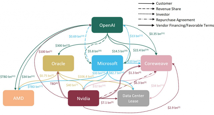
Source: Company Data, Morgan Stanley Research.
In May, Apollo and Blackstone announced a deal[8] to provide $36 billion of financing to buy Google TPUs (an alternative to GPUs) and lease them to Anthropic. The deal will be via a special purpose vehicle, which means that it sits outside of Anthropic’s balance sheet. This illustrates how private credit markets are helping finance the AI capex boom. Risk is being moved around the financial system in a way that can be hard to follow, with Michael Burry[9] recently showing how Apollo’s deals shift risk via insurance companies onto US retirees.
The combination of leverage, opaque financing arrangements, and risk being shifted in creative ways is, in my eyes, a smoking gun. It is not proof that we are in a bubble, but they have all been seen in previous financial crises. For it to not be a bubble requires the newly built assets to earn strong economic returns.
Return on Invested Capital
What is knowable, right now, is the amount of money being spent on data centres. What we don’t know is the returns that these investments will generate.
Capital expenditure at Microsoft, Alphabet, Amazon, Meta and Oracle is expected to be more than $600 billion in 2026, and in each of the subsequent three years. I estimate that if this year’s investments were to generate the same returns on invested capital and same operating margins as 2025, it would need a 25% increase in revenue next year. This equates to an additional $413 billion of revenue across all five, or about $50 for every person on the planet.
Panmure Liberum recently produced a comprehensive paper exploring this subject further[10]. They use analyst forecasts of both capital expenditure, and future revenue up to 2030, to try to estimate likely returns on investment. Under the most optimistic assumption, that all this revenue flows through to profits, they estimated that all five, except Amazon, will see negative rates of return on their investments.
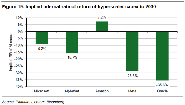
What this tells us is that the only credible justification for the current AI capital expenditure is if it creates long-lived assets that can generate significant future profits. It clearly isn’t justified by short-term revenue expectations.
Canal Mania
Before saying any more on AI, I make a brief detour to 1790. Bear with me, as I think it is relevant.
Between the 1790s and 1810s there was a boom in canal building[11] in the UK, with large amounts of capital being spent to literally dig holes and fill them with water. At the time it was revolutionary, as it allowed heavy goods to be easily moved by boat instead of by horse and cart. It unlocked demand for coal, making it affordable for city dwellers to heat their houses. In modern parlance, the “Total Addressable Market” for warmth was huge, meaning that the intrinsic value of canals was also big. Dig baby dig!
The upfront cost of building the canals was arguably justified based on an expectation that many years of profitable use lay ahead. However, the “next generation” technology of railways started to supersede the canals in the 1840s. Moving goods by rail proved superior, rendering the canal infrastructure obsolete, and rapidly destroying the monopolies of the incumbent canal owners.
The eras of building canals and railways are now associated with financial bubbles or manias. This is not to say that all this investment was misguided, but the hope of earning monopoly-like profits led to lots of marginal schemes that made no economic sense. What was clear in both cases is that many promotors were motivated to get rich in the early capital raising and construction stages, without regard for the long-term economics.
There are two lessons I take from these examples. Firstly, the technology of canals was superseded by railways. The risk of building expensive new infrastructure is that it is not as long-lived as you first think. Secondly, monopoly profits did not come as easily as was hoped. In the fullness of time some routes proved lucrative, but many were not.
Viewing AI through the lens of canal-mania begs two questions;
- How long-lived are the assets that are being created?
- Will these assets earn monopoly profits for their owners?
Two different types of assets
The obvious assets being built are the physical inference data centres, the less obvious ones are the businesses for which they are a prerequisite, such as Anthropic or OpenAI.
More than half of data centre costs are being spent on servers with lifespans of only 3-7 years, meaning they need to justify their existence ASAP. Conversely, permitting, land, grid connections, and physical buildings are long-lived, but are they going to lead to monopoly profits?
In a world of physical supply constraints, like the three-to-four-year backlog to buy an electrical transformer[12], the rate at which data centres can be built is limited. These constraints are real, but I don’t expect them to last indefinitely. Whilst London, Tokyo or New York real estate is an enduring scarce asset, it is harder to make the same case for data centre real estate. To this end there is at least one company planning to build AI data centres in space[13]! Might this also be a further sign of a bubble?
Using this logic suggests that the real hope for monopoly profits, lies in the businesses that the data centres will spawn. In the dot com era Google won the race to dominate search, which paved the way for it to have a seemingly impenetrable competitive position in internet advertising. Likewise, Amazon came to dominate shopping, and Netflix rental movies. In these cases, their dominant competitive position came from a winner-takes-all set of economics.
It seems reasonable to imagine that new business models will emerge with equally dominant positions, but it is hard to think that many people will correctly anticipate what they will be. When they built a canal to ship coal from the mines at Worsley to the city of Manchester, the monopoly they were going after was clear. I find it harder to make the same case for the AI companies today. This is not to say that I think monopolies won’t be created, but are they being correctly anticipated by the financial markets?
The bull argument that I have heard, is that there is an effectively limitless demand for intelligence. Most organisations costs are dominated by people, and there will be huge demand to replace them with cheaper AI. This is a reasonable argument, but it lacks specificity. It suggests that the data centre infrastructure is necessary because it is a job that only general-purpose algorithms can do. It also avoids getting into the weeds of the true cost of running these models.
The Panmure Liberum note gives the example of “small language models” as an alternative route to automation. You can think of these as algorithms tailored to specific purposes, which as a result don’t require much computing power. They give the example of the podcast provider, OverCast, who estimated it would cost $30 million a year to use OpenAI to transcribe their podcasts. Using a small language model tailored to audio transcription, they were able to complete the same task using basic hardware at a cost of around $10,000 per year[14].
Like my example of supermarket checkouts, you can be bullish on the prospects of automation, without needing to be bullish on expensive data centres.
The foundational model companies are currently subsidising the use of their general-purpose algorithms in a land grab for future monopoly profits. The extent of this is made clear by OpenAI’s video creation platform, Sora[15]. The platform was reputed to be costing roughly $15 million per day in inference costs, whilst having generated lifetime revenues of just $2.1 million. They made the decision to shut it down earlier this year, clearly doubting if it could ever be economically viable.
The broader economy
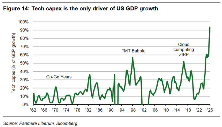
As large sums of money flow into AI capex, there is a risk that it causes larger impacts on the broader economy. The chart below is from the Panmure Liberum note and shows a long-term history of technology capex as a percentage of US GDP growth. This suggests that nearly all the current growth in US GDP is explained by the AI construction boom. Without the data centres, it suggests there would be not much GDP growth at all.
This is reminiscent of other large infrastructure bubbles[16], where the overall health of the economy becomes increasingly intwined with speculative capital expenditure. What I also see happening, is that it is driving the “wealth effect”. As asset owners feel flush, off the back of ever higher market moves, it drives further economic activity. Those who don’t own assets get jealous, drawing more people into dreams of riches. I can’t remember the last time I used the Tube and didn’t see an advert for a trading app or investment platform!
This combination of AI capital expenditures and the wealth effect risks the overall health of the economy becoming increasingly dependent on the AI narrative. This boost to the economy comes on the heels of a prolonged period of both low interest rates and declining corporation taxes, both of which have boosted company profits. As described by Ruchir Sharma[17] increases in government debts since the financial crisis have had a direct and positive impact on corporate profits. It makes me concerned that we are seeing castles being built on sand.
The Mother of all Bubbles?
I titled this piece “The Mother of all Bubbles?”. Why?
I thought it might encourage more people to read it. That wasn’t the only reason though.
My overarching concern is that the combined effects of low interest rates, soaring government deficits, topped off with a period of irrational exuberance, are having a massive distorting effect on economies and increasing risk in the financial system. As a student of market history I am versed in previous speculative manias, especially those driven by heavy infrastructure spending. It is the fear that we are witnessing a speculative mania on top of the distorting effects of prior economic policies that motivated the title.
I am bullish on the prospects of technology, bullish on automation, and am sure that many significant new AI businesses will be created in the years ahead. What I am not bullish on is the stock markets’ ability to correctly anticipate this! I see a meaningful risk that much of the AI construction ends up looking like the canals, where it is useful, but the cost was not justified based on subsequent monopoly profits. Even if it does prove justified, I am sceptical of how much of the benefit accrues to shareholders over company insiders.
This thinking all feeds into my investment decisions and is the reason why I want us to own a portfolio that is not geared towards a continuation of the status quo. Although this is perhaps easier said than done, worrying about what might go wrong in markets is at least a starting point.
The Mother of all Opportunities?
The flipside of capital rushing towards the perceived AI winners, is that it’s being sucked out of many perceived losers. I think this is creating a lot of opportunity for value investors, as many decent companies have seen 50%+ falls in share price. I believe this is exacerbated compared to prior bubbles, because of the increasing dominance of long-short hedge funds, pod shops, and options trading, all of which is focused on the short-term.
S&P produce a dispersion index[18], which is an attempt to measure how S&P 500 constituents are moving relative to each other. A low level of dispersion means they are all tending to move up and down in unison, and conversely a high level means they are doing their own thing. In the last couple of months dispersion amongst S&P500 companies has spiked, which gives me more confidence to assert that we are seeing an increase in opportunity. It also fits with what I am seeing on the ground.
The chart below clearly illustrates how dispersion has suddenly spiked this year.
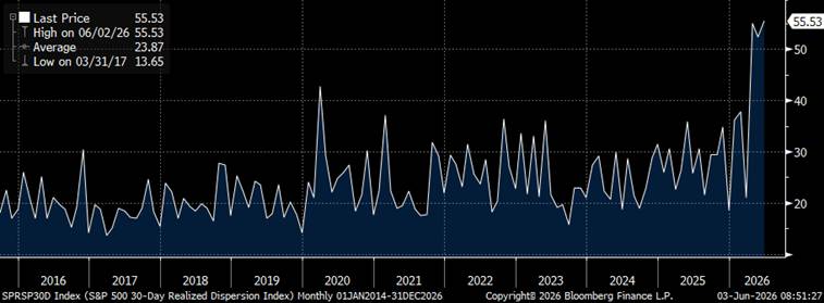
Source: Bloomberg
I thought the point sufficiently important that I’m including two dispersion charts. The second one shows the long-term history of the same index, with its current level marked on in red. This illustrates how dispersion spiked in both the dot com bubble and the global financial crisis at similar levels to today.
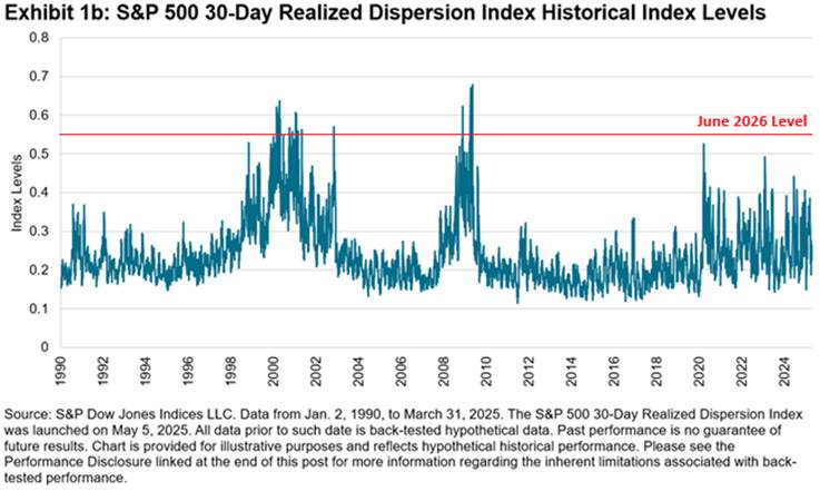
Source: S&P Dow Jones Indices
As well as dispersion within US companies, we are also seeing dispersion between countries. The current AI boom is drawing capital to the US, where these companies are based, and away from other geographies. This is illustrated by the MSCI World index now having a 72% weight to US companies (versus a 3.7% weight to the UK). This is “old news”, but I still see it as suggestive of there being opportunity for those who can be genuinely patient. By way of example, many UK specialist investors are talking about “generational opportunities” and point to increased takeover activity as validating these views.
This whole story is complicated by the rising dominance of passive investing, where new investment flows are automatically directed towards the largest companies. This point is not lost on the soon to IPO AI companies, who are expecting the world’s savers to buy up shares in their currently unprofitable businesses. It is true that passive investing has altered the financial market ecosystem, but it still seems a stretch to think that share prices and fundamentals will be detached forever more.
Not all the companies that have seen large price falls will make for bargains. Many were falling from a starting point of extremely high valuations, and many just aren’t particularly great businesses. However, in picking through the wreckage of these price falls I am finding opportunities that make me excited. More so than in the earlier years of the fund I feel overrun with potentially interesting new ideas.
The conclusion I wish to deliver is that whilst I think it likely that we are witnessing a bubble, it has simultaneously made many corners of the stock market cheaper. There can be no guarantees that these seeds of opportunity will germinate into profitable investments, but I feel that history is on our side.
I will end by saying that as I was writing this note, an email arrived in my inbox from a UK retail investment platform offering me to participate in the SpaceX IPO. The insiders of SpaceX, Anthropic, and OpenAI are all motivated to sell ownership of their companies to the public. Is this a reason to get excited? Or yet another sign of a bubble?
Matthew Beddall
Click here to download as a PDF
[1] https://en.wikipedia.org/wiki/Economic_bubble
[2] https://en.wikipedia.org/wiki/Artificial_intelligence
[3] https://epoch.ai/gradient-updates/after-the-chatgpt-moment-measuring-ais-adoption
[4] https://galileo.ai/blog/llm-model-training-cost
[5] https://milvus.io/ai-quick-reference/how-long-does-it-take-to-train-an-llm
[6] https://blogs.nvidia.com/blog/ai-tokens-explained/
[7] Amelia Michael and Ben Cottier (2026), “Servers account for 60% of the total cost of ownership of a one-gigawatt AI data center”. Published online at epoch.ai. Retrieved from ‘https://epoch.ai/data-insights/ai-datacenter-cost-breakdown’ [online resource]. Accessed 1 Jun 2026.
[8] https://aiweekly.co/alerts/apollo-backs-36b-record-debt-deal-for-anthropic-tpus
[9] https://michaeljburry.substack.com/p/short-thoughts-may-29-2026
[10] https://research.panmureliberum.com/view/FD91B03A-3DB8-4EF8-99B3-478C1AFC983A?uid=michael.finney@panmureliberum.com&jobRef=1032205_20260512_150546
[11] https://en.wikipedia.org/wiki/Canal_Mania
[12] https://berlin.cwiemeevents.com/articles/new-normal-component-suppliers
[13] https://www.mckinsey.com/industries/technology-media-and-telecommunications/our-insights/the-case-for-data-centers-in-space
[14] https://braddelong.substack.com/p/is-the-day-of-the-data-center-about
[15] https://www.mindstudio.ai/blog/inference-costs-ai-wall-sora-shutdown
[16] https://frompovertytoprogress.substack.com/p/the-largest-investment-booms-in-history
[17] https://www.ft.com/content/362ccc0a-d6e5-40df-817f-64aea4717cc8
[18] https://www.spglobal.com/spdji/en/indices/other-strategies/sp-500-30-day-realized-dispersion-index/