The collapse of Silicon Valley Bank has sent shockwaves through the financial markets, with many investors being blind-sided by the true state of their balance sheet that led to a run on the bank. There is no shortage of analysis on what happened at SVB, but the question I think investors now need to ask is what are the further implications of higher interest rates for the banking industry.
There are, broadly speaking, two ways that a bank can earn a profit with the money lent to it by depositors. The first, and obvious, is to lend directly to one of the bank’s customers, and the second is to purchase financial securities. These securities typically are also loans, but that have been conveniently packaged so as to be easily bought and sold within the financial markets. Whether they take the form of government bonds, corporate bonds, or bundle of mortgages, all are loans.
The risk that the world has woken up to, is that if a bank declares an intention to hold investment securities until they mature, it need not recognise the interim losses suffered from their fall in value. This is fine until the point that depositors ask for their money back. As we saw with SVB, if customers think that the bank doesn’t have the capacity to absorb these losses, then a stampede to exit will follow.
Loans when packaged into financial securities provide transparency, as their market prices give the consensus view of what they are worth. This, arguably, can deviate from their true intrinsic value, but it does reflect changes to interest rates and concerns on the risk of credit losses. A bank’s direct loans to customers, on the other hand, do not have this transparency. They will be impacted by higher rates, but it will take a long time to know exactly how.
The strategy that SVB followed was to own liquid securities, as opposed to making illiquid loans. Given the risk of their depositors leaving, it was not a crazy thing to do, but it is ironic that it then caused a “liquidity” crisis. The mistake that they made was not due to the medium of purchase being tradeable securities, but rather due to the underlying exposure to the risk of higher interest rates.
Direct loans held by banks are also at risk from higher interest rates as, in the same way as if they were tradeable securities, the resale value of these loans will have declined. It is incorrect to think that a bank that owns lots of securities has assumed more interest rate risk, than a bank that has instead made lots of illiquid private loans. Yet, if recent share price falls are anything to go by, many investors are making this mistake.
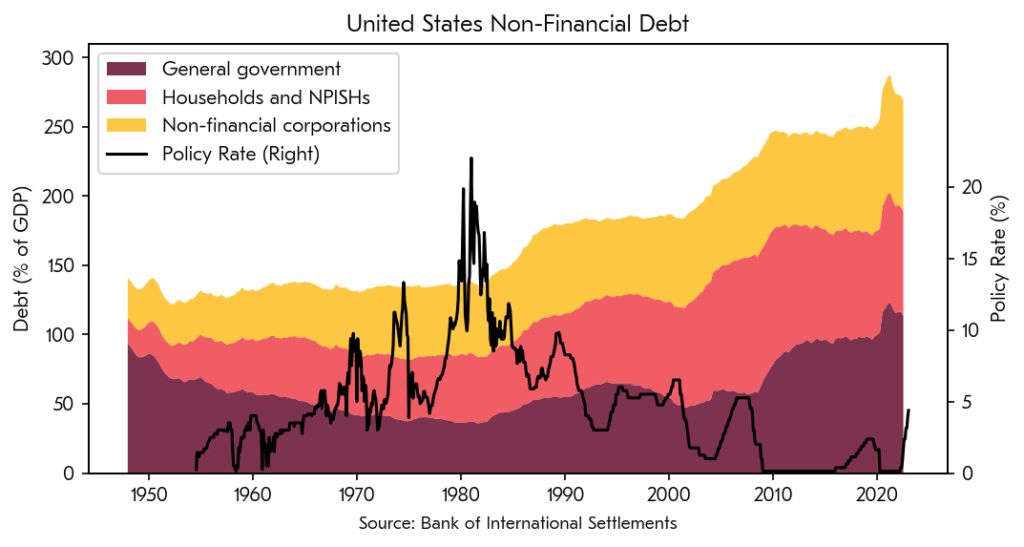
Although there are as yet few signs of distress, higher interest rates will also increase the chances of borrowers not making their interest payments or being able to roll-over loans when they come due. I believe that the credit losses that follow from this will take time to become apparent, as the pressure of higher rates will have a lagged effect on many borrowers.
The three big risks that bank shareholders are exposed to are interest rate risk, credit risk and liquidity risk. I think that investors must think about all three of these risks if they are to avoid nasty surprises. The current narrative on SVB threatens not only to confuse interest rate risk for liquidity risk, but also ignoring the risk of credit losses that will follow from higher rates.